
How to Choose the Right Neon Sign Size for Your Space
Quick answer:
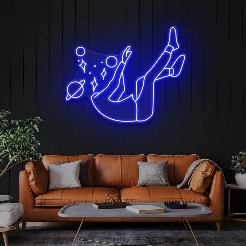
Choosing the right neon sign size depends on wall width, viewing distance, and how the room is used. As a general guideline, neon signs usually look best when they take up about 60–75% of the available wall width, adjusted for ceiling height and lighting conditions.
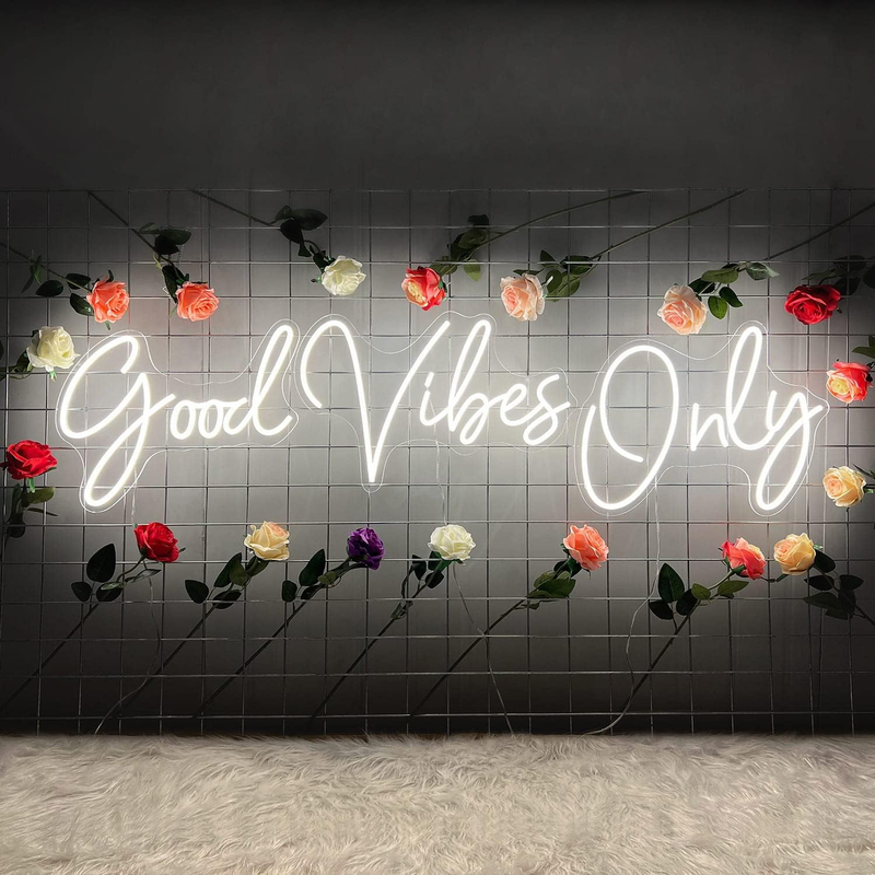
Neon signs can completely change how a space feels. The right size makes a room feel balanced and intentional, while the wrong size can make even a good design look awkward or overwhelming. Choosing the correct neon sign size isn’t about guessing or following trends—it’s about understanding space, proportion, visibility, and real-world limitations.
This guide walks through how to choose the right neon sign size for your space in a practical, realistic way.
Why Neon Sign Size Matters More Than You Think
Most people focus on color or wording first, but size often has a bigger impact on how a neon sign actually performs in a space.
A sign that’s too small may technically fit the wall, but it can disappear visually—especially in bright rooms or larger areas. On the other hand, a sign that’s too large can dominate the room, feel cluttered, or even cause eye fatigue over time.
Neon sign size affects:
-
Readability from a distance
-
Visual balance with furniture and décor
-
Installation difficulty
-
Brightness perception and glare
-
Long-term comfort in the space
Ignoring size often leads to regret, even if the design itself is well done.
Start With the Wall, Not the Sign
A common mistake is choosing a neon sign first and then trying to “make it work” on the wall. A better approach is to evaluate the wall or surface before thinking about the sign itself.
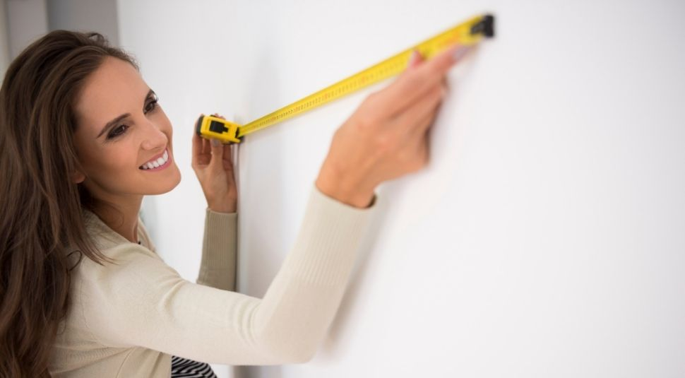
Measure the Available Space Accurately
Use a tape measure and note:
-
Wall width and height
-
Obstacles like shelves, windows, switches, or artwork
-
The visually usable center area
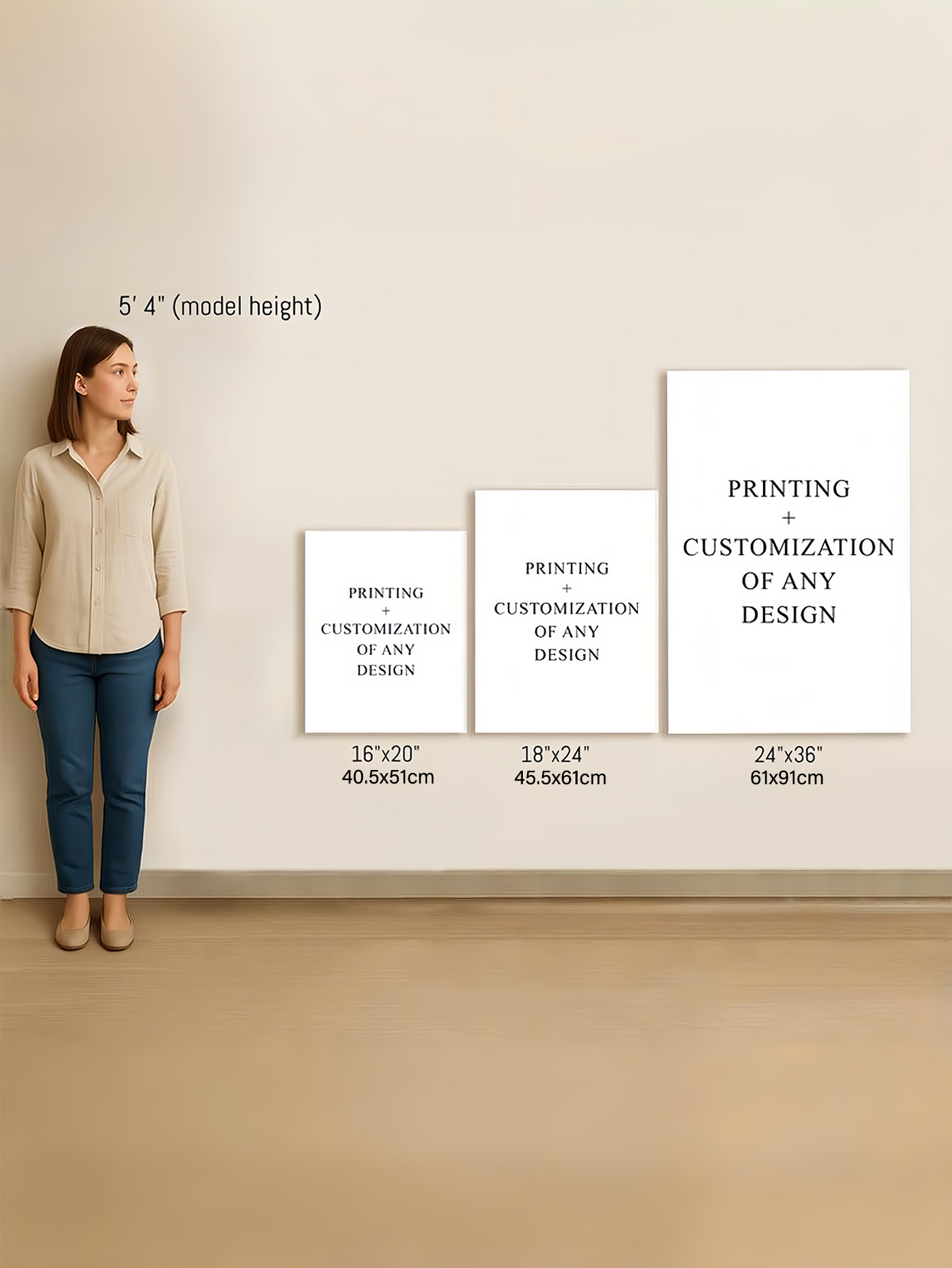
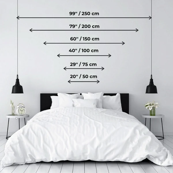
As a general guideline, a neon sign should take up 60–75% of the available wall width. Less than that often looks underwhelming; more than that can feel cramped.
This isn’t a strict rule, but it’s a reliable starting point for most spaces.
Consider Negative Space
Negative space—the empty area around the sign—is just as important as the sign itself. Too little space makes the sign feel crowded. Too much space can make it look lost or accidental.
If your wall already includes strong visual elements such as textures, patterns, or large furniture, a slightly smaller sign often looks more intentional.
Match Sign Size to Viewing Distance
How far away people typically stand or sit from the sign matters a lot.
Close Viewing Distance (1–2 meters / 3–6 feet)
Common in:
-
Bedrooms
-
Home offices
-
Small studios
Smaller signs, usually 30–60 cm (12–24 inches) wide, work best here. Anything too large can feel intense or distracting, especially at night.
Medium Viewing Distance (2–4 meters / 6–13 feet)
Common in:
-
Living rooms
-
Cafés
-
Retail interiors
Mid-sized signs around 60–100 cm (24–40 inches) tend to look balanced and stay readable without overpowering the space.
Long Viewing Distance (Over 4 meters / 13+ feet)
Common in:
-
Storefronts
-
Event spaces
-
Large open rooms

Larger signs are often necessary, but this is where practical issues begin. Bigger signs weigh more, cost more, and are harder to mount securely. Not every wall is suitable for very large neon signage.
Common Neon Sign Size Recommendations
These are general, experience-based guidelines—not rules—but they help avoid obvious sizing mistakes.
| Space Type | Typical Wall Width | Suggested Sign Width |
|---|---|---|
| Bedroom | 120–180 cm | 40–70 cm |
| Living Room | 200–300 cm | 70–100 cm |
| Café Wall | 250–400 cm | 90–140 cm |
| Storefront | 300 cm+ | 120 cm or larger |
Always adjust based on ceiling height, lighting, and nearby furniture.
Ceiling Height Matters More Than You Expect
Ceiling height has a strong effect on how large a neon sign feels.
In rooms with low ceilings, tall or oversized signs can feel overwhelming even if the width is correct. In spaces with high ceilings, wider horizontal signs often look more balanced than tall vertical designs.
Ignoring ceiling height is a common reason why a sign looks “off” after installation, even when measurements seemed correct on paper.
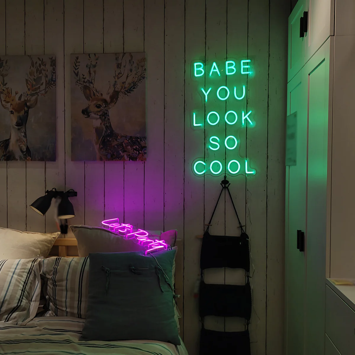
Understand Text Length and Shape
Two neon signs with the same width can feel very different depending on their layout.
Short Words vs. Long Phrases
-
Short words or logos often look better at larger sizes
-
Long phrases become harder to read when scaled too large
-
Trying to fit long text into a small size usually leads to thin tubing and poor spacing
Script vs. Block Fonts
-
Script fonts need more width and height to stay legible
-
Block or sans-serif styles remain readable at smaller sizes
Choosing a font that doesn’t match your size constraints is a subtle but very common mistake.
Brightness Perception Is Not the Same as Size
A larger neon sign doesn’t automatically mean better visibility.
Large signs with high brightness can cause glare or visual fatigue, especially in darker rooms. Smaller signs can sometimes appear brighter than expected in low-light environments.
Size and brightness should be considered together, not separately.
Room Function Should Influence Size
The purpose of the room should guide how visually dominant the sign is.
Decorative Spaces
In bedrooms or personal spaces, neon signs usually work best as accents. Smaller or medium sizes tend to feel calmer and more intentional.
Branding or Commercial Spaces
In shops or cafés, visibility matters more. Larger signs make sense—but only if the wall, lighting, and viewing distance support them.
Event or Photo Backdrops
Oversized signs can work well temporarily, but they often feel impractical for permanent installation. Many people underestimate how much visual space these signs occupy once installed.
Real Downsides of Choosing the Wrong Size
Neon sign sizing is often romanticized online, but real-world issues are common.
Too Small
-
Looks cheap or accidental
-
Hard to read in daylight
-
Easily overpowered by other décor
Too Large
-
Difficult to install securely
-
Can cause glare or eye strain
-
Feels visually heavy over time
-
Limits future layout changes
These problems often only become obvious after installation.
Practical Tips Before You Decide
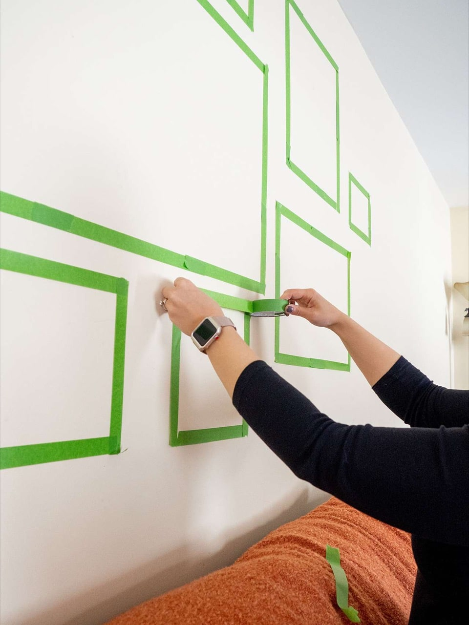
Before committing to a size:
-
Use painter’s tape to outline the sign on the wall
-
View it from different angles and distances
-
Check how it looks with lights on and off
-
Consider ceiling height and nearby furniture
-
Don’t rely solely on digital mockups—they often exaggerate scale
Final Size Checklist Before Ordering
-
☐ Wall measured accurately
-
☐ 60–75% width guideline checked
-
☐ Viewed from normal standing distance
-
☐ Ceiling height considered
-
☐ Lighting conditions tested
Choosing the right neon sign size isn’t about making the biggest statement possible—it’s about making the space feel intentional. A well-sized sign blends naturally into the room instead of competing with it.